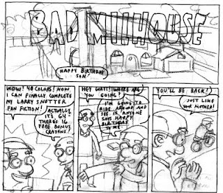
After agreeing to take on the Simpson's in a short story for this year's Treehouse of Horror issue, I started figuring out how I wanted to draw the characters. The big problem was having them be enough in my own style, but also staying true to the characters as most people know them. I had abandoned this story about the seeing the Red Wings play the Blackhawks in last season's NHL Winter Classic game, so I used the space to sketch out Milhouse and friends instead. Please note that all likenesses and images of the Simpsons and this story are copyright by 20th Century Fox Inc.

As I started to get a feel for the characters, I also needed to test out coloring. This was a piece of illustration board, with the line work drawn in my standard Uniball Deluxe Micro pen, and colored with Faber Castell brush pens.

Next up was laying out simple thumbnails for the story. I probably could've made this a 32 page story, but I had 8 pages to work with so I streamlined it as much as I could and planned it out on little pieces of Bristol.

After figuring out the basic story, I pencilled it out on illustration board, drawing at actual print size. Since they'd asked if we could do the lettering separate (for ease in printing translations) I practiced adding the lettering on sheets of tracing paper.

I inked the story's line art with my Uniballs, and then started coloring. Despite testing previously, I screwed something up, or I guess didn't do enough testing, so page one became another test page and had to be redrawn.

I got a handle on the coloring and completely colored four pages before giving into the feeling that the look and the feel wasn't just right for the story. Not claustrophobic enough, not dark enough, and looking a bit to polished or something. I decided I was probably drawing the story too big, since I usually draw smaller, so I resized things to something like 70% of print size, and re-drew the whole story at the new size, with much more satisfying results.

I still needed to figure out the lettering, and this is one of about four versions. As I re-did the lettering each time, though, I also adjusted some of the text slightly. Sammy also talked to me about changing the ending slightly, which made sense and after some thinking I figured out a better ending that fit the story well.

The final artwork had a tighter, more packed feel, to feed into the story's plot about Milhouse living in the walls of the Simpsons house.

Finally I had to fit the finished text in with the artwork, which required some adjusting, since I drew everything separate without using the computer, which would've no doubt made the whole process simpler. All in all, I'm pretty happy with how the story turned out, although it was also a good learning experience and I'd probably have a better method for doing something like this next time around.
Head out to your local comic shop, book store, or other Bongo Comics outlet to pick up your copy today. I haven't had a chance to sit down and read it yet, as I'm getting ready for SPX this weekend, but seeing the artwork from Sammy Harkham, Jordan Crane, Tim Hensley, Kevin Huizenga (not to mention Dan Zettwoch's awesome cover) should make this one of the best Treehouse of Horror issues yet.
Very cool. You have a very unique (I imagine) method. Which results in a very unique and charming style. I think you were extremely successful at honoring Groening while keeping it your own. I need to track this down and check it out in full!
ReplyDeleteThis whole comic was great. I really enjoyed all the stories. Ben Jones' Bootleg story was incredible.
ReplyDeleteThis comment has been removed by the author.
ReplyDeleteHow did you managed to get darker, more desaturated tones with the Faber Castells?
ReplyDeleteLooks really great and very much in your style.
I can't wait to pick this up
ReplyDeleteI love the process.
ReplyDeleteVery cool process, awesome results
ReplyDeleteThis is easily my favourite story from the collection. I like everything about it.
ReplyDeleteThanks everyone! The darker tones come from a lot of layering - laying down a block from a lighter pen, often the lightest grey shade, or using the greys to shade other colors. Also, the line work was done with Uniball Deluxe Micros, which aren't entirely waterproof, so the Faber Castell pens pick up some of that ink and gives it all a little bit darker look.
ReplyDeleteLooks great Jeff. Thanks showing all the details on how you got there; its very cool to see it all come together.
ReplyDelete-nate